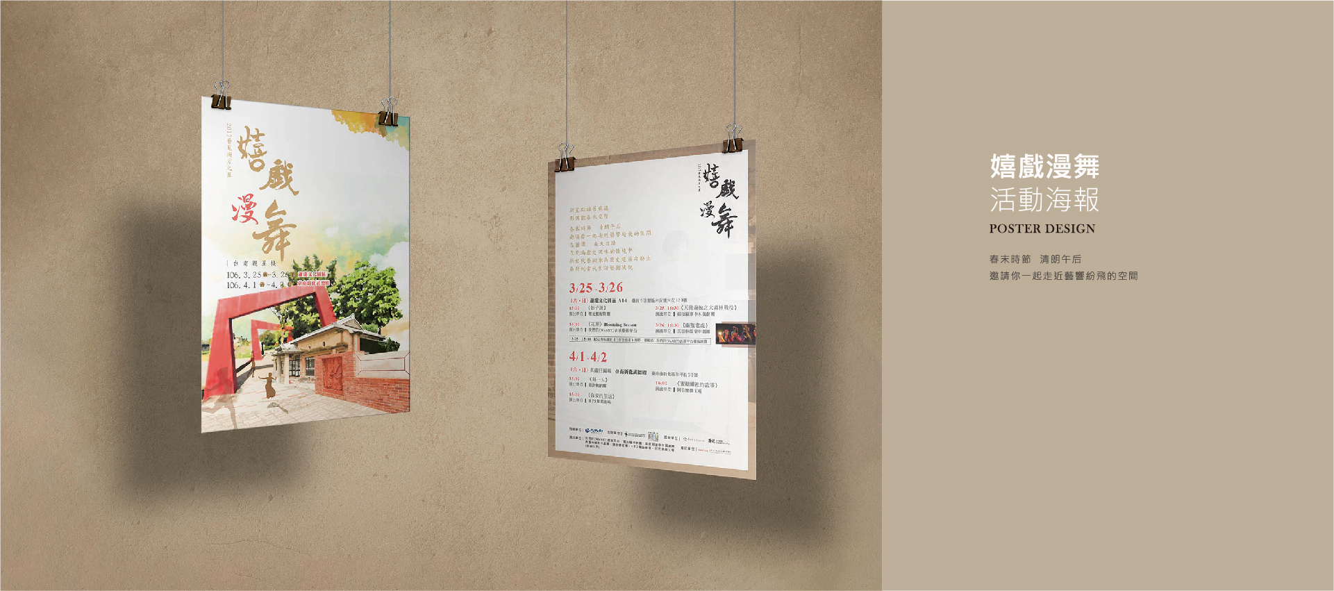
| COLOR PROJECT
色彩計畫 |
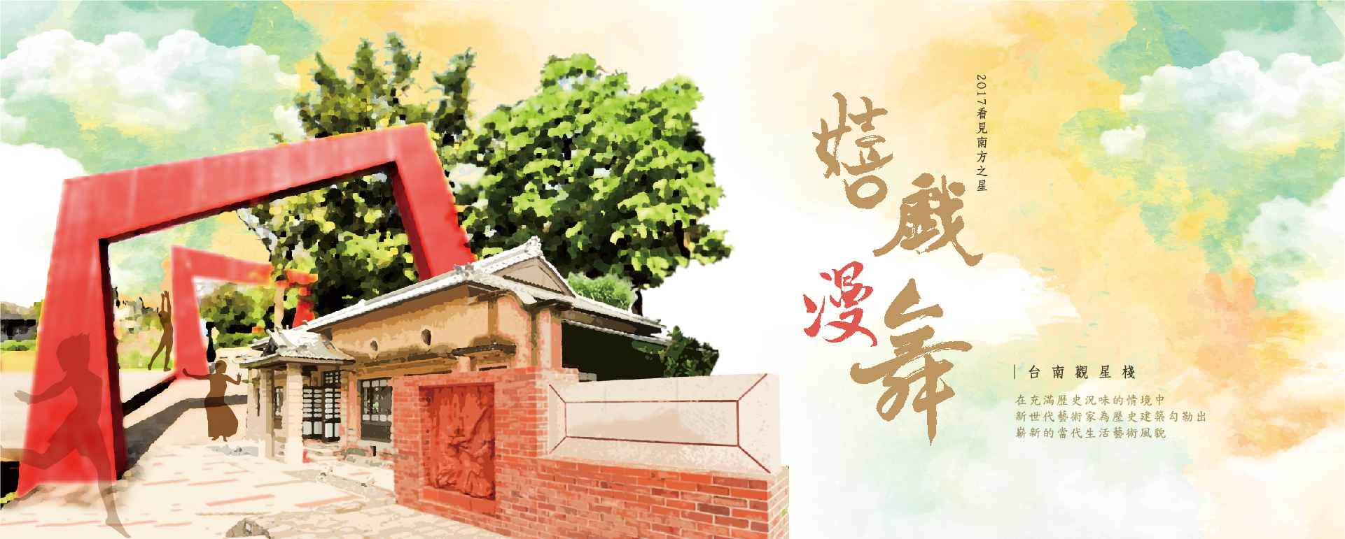
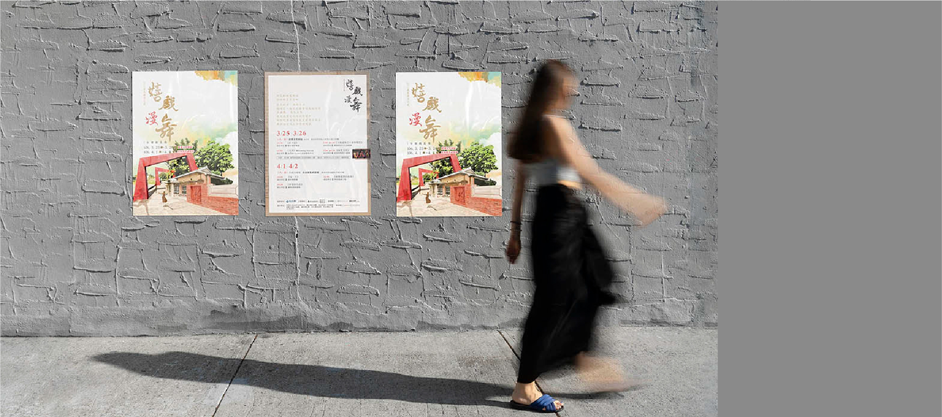
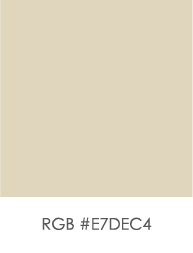
咖啡色:選擇淺咖啡色作為海報的背景色,給人溫暖和穩定的感覺,同時不會過於搶眼,讓其他元素能夠更加突出。
金色:使用金色的字體來呈現表演的標題,能夠立即吸引觀眾的注意力,與舞蹈的藝術性和優雅感相呼應。
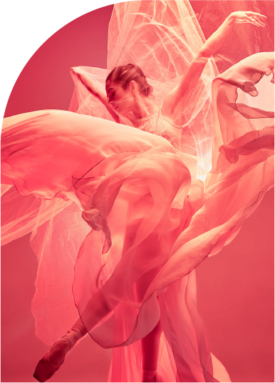
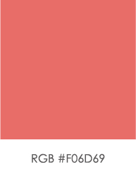
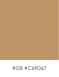
紅色:紅色作為主要的裝飾色和舞者的服裝顏色,紅色充滿激情和活力,完美地傳達出舞蹈表演的動感和熱情。
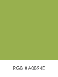
綠色:代表希望和生機,為整個設計增加一絲清新感,平衡紅色的強烈視覺效果。
ackground: Choose light coffee color as the background of the poster. This gives a warm and stable feel, ensuring it is not too eye-catching so that other elements can stand out more.
Title: Use gold-colored fonts for the performance title. which can immediately attract the audience's attention and resonate with the artistry and elegance of the dance.
Main Elements: Red is used as the primary decorative color and the color of the dancer's costumes. perfectly conveying the dynamic and enthusiasm of the dance performance.
Accents: Green represents hope and vitality, adding a touch of freshness to the overall design and balancing the strong visual impact of the red.